
Project type: Enterprise Application // Employer: Discovery Education
Product: Discovery Experience
TL;DR:
Overwhelming Search Results to Decision Confidence
Challenge: Teachers struggled to find the right resource within a library of hundreds of thousands of assets, often navigating dense, inconsistent UI patterns across results.
Insight: The core issue wasn’t the search interface itself, but a lack of decision confidence driven by unclear metadata, inconsistent content presentation, and weak visual hierarchy in how results were structured and displayed across devices.
Solution: Redesigned search and discovery experiences with a focus on scalable UI patterns, reusable design system components, and responsive layouts. Clarified content structure, improved metadata signaling, and introduced more consistent, adaptable interface patterns across search, filtering, and content cards.
Outcome: Faster and more confident resource selection, improved clarity across devices, and a more scalable, component-driven foundation for search and discovery across the platform.

Responsive design snapshot
Discovery Education: Search & Standards Experience
Transforming search to surface the right resources, at the right time, for every teacher.
THE CHALLENGE
Teachers struggled to find the right resources in a massive K–12 library. Search felt overwhelming, inconsistent, and cluttered with similar results. High-value and standards-aligned materials were hard to spot, and a rigid card layout buried the best content.
Goal: Redesign search to be smarter, clearer, and aligned to how teachers plan and teach.
CONTEXT
Discovery Education Experience is a core educational toolkit used daily by teachers to plan lessons, match resources to standards, and supplement instruction. Search directly influences:
Daily engagement and resource adoption
Teacher confidence in instructional planning
District-level renewal and product trust
Improving the search experience wasn’t just a UX win, it was a driver of long-term teacher success and platform reliance
THE BUSINESS GOALS
Improve search relevance and usability
Surface high-value, standards-aligned content
Strengthen district renewal confidence
Create flexible foundations for personalization and future discovery

Redesigned resource cards
Redesigned resource cards using a flexible component-based framework that could adapt to different content types, screen sizes, and instructional contexts. The system surfaced critical metadata such as grade level, standards alignment, duration, and instructional intent while maintaining consistency across the experience.
DESIGN SYSTEM CONTRIBUTION
To support a growing content ecosystem, the solution was built using reusable interface patterns rather than one-off screens. Search cards, filters, metadata treatments, content clusters, and navigation patterns were designed as modular components that could scale across future Discovery Education experiences.
This approach improved consistency, reduced design and engineering effort, and created a foundation for future personalization initiatives.

Search Standards snapshot
MY ROLE
Partnered closely with product managers, engineers, researchers, and curriculum experts to create scalable, component-based experiences that balanced educator needs, technical constraints, and business goals.
Designed reusable search, filtering, navigation, and content-card components that strengthened discoverability while establishing consistent UI patterns and design system foundations across the platform.
Defined responsive behaviors, interaction patterns, and component specifications to ensure a cohesive experience across desktop, tablet, and emerging learning environments.
Collaborated with engineering to develop implementation-ready solutions, scalable interaction models, and reusable UI frameworks that could evolve alongside future content, products, and platform needs.
Translated complex educational standards, metadata systems, and content relationships into intuitive workflows, responsive interfaces, and clear visual hierarchies that improved usability across devices and screen sizes.
Led end-to-end product design for Discovery Education’s search and standards experience, from discovery through implementation.
RESEARCH & INSIGHTS
Our research surfaced two core insights that shaped the entire design direction:
1. A one-size-fits-all card layout limited discovery.
Teachers were overwhelmed by long lists of uniform result cards where standards, grades, and content type were buried. This made it hard to scan for what mattered most: instructional fit and standards alignment.
2. Filter labels and search behaviors lacked clarity.
Many teachers didn’t understand how filters worked together, especially with standards filters. This led to frustration, redundancy, and low confidence in results.
These insights moved the project beyond cosmetic tweaks. We needed to rethink how information was organized and communicated visually.
DESIGN STRATEGY
Enhanced Information Hierarchy & UI Framework
We evolved the experience from a rigid, one-size-fits-all card structure into a flexible, component-based system that adapts to content type and instructional intent. Reusable layouts, metadata treatments, and content patterns allowed teachers to quickly identify the information most relevant to their task while creating a scalable foundation for future content experiences.
Improved Search Results Logic
Prioritized high-value assets (lessons/activities) to appear throughout results, not just at the top
Dynamic groupings (clusters and snippets) help guide teachers to rich instructional resources faster
Filter & Standards UX Revamp
We simplified and clarified filter naming through iterative rounds of testing, significantly reducing ambiguity and cognitive load. We also reimagined “Browse by Standards” to mirror actual state structures, making standards navigation predictable and intuitive.
Refined Metadata + Tagging
Working with content teams, we updated tagging and metadata to surface priority details like grade level, instructional intent, and standards alignment (critical signals for teacher decision-making)

Audited and simplified filter naming
Teachers overwhelmed and confused by DE filter naming conventions.
Teachers felt overwhelmed by Discovery Education’s naming conventions and unclear connections between assets. To address this, the team conducted a comprehensive audit followed by multiple rounds of iteration and usability testing to identify an approach that helped teachers quickly recognize which resources were most relevant. The resulting solution ensured the information shown in search better supported confident, informed selection.
KEY FEATURES & UX ENHANCEMENTS
Browse by Standards: Reformatted to mirror each state’s structure
Combine Keyword + Standards Filtering: Teachers can narrow by keyword and standards for precision.
Refined results organization: Prioritized lessons/activities; grouped videos; surfaced related assets dynamically
Improved tagging: Updated data alignment with the latest core subject standards
Flexible UI system: Created reusable content patterns and adaptive layouts capable of supporting different resource types, instructional contexts, and future platform enhancements without requiring entirely new experiences.
BEFORE -> AFTER: MAJOR IMPROVEMENTS
Before:
Static, uniform card list
Rigid hierarchy that hid critical metadata
Confusing filters and low discovery confidence
After:
Modular, adaptive layouts
Clear metadata surfaces at a glance
Streamlined filtering with standards at its core
Teachers find better content faster and with confidence
IMPACT & OUTCOMES
While Discovery Education does not publicly share full quantitative results, the redesign was launched with measurable improvements in usability and teacher confidence, as reflected in internal assessments. Teachers reported:
Stronger ability to find relevant resources more quickly
Greater clarity on standards alignment
Improved trust in search and filtering behavior
KEY LEARNINGS & REFLECTION
Be prepared to pivot constantly! The project moved quickly and was of paramount importance to executive leadership. Feedback came from everywhere and all the time. To manage the large volume of feedback, keep my sanity, and meet the project goals, I focused on a couple of key strategies.
People are busy! I used async reviews for walkthroughs and design iterations. This gave stakeholders time to review, consider, and respond. I also established weekly follow-ups (with my PM) to prioritize and categorize feedback based on the goals, feasibility, and user impact. In weekly meetings with stakeholders, I had a note-taker on hand, used Zoom to summarize, and created a Slack channel to avoid fragmented feedback.
OLD PRODUCT
Discovery Education: Search results page

NEW PRODUCT
Refined results organization, filtering, card design


Responsive search standards
Anatomy of a video card.
Teachers searching for videos often saw hundreds of nearly identical results because short clips were pulled from longer parent videos. A search like “photosynthesis” returned every related segment, making it impossible to identify the most useful option.
To fix this, we consolidated all segments into a single parent video card. The clip that matched the teacher’s search was elevated to the top, and all other segments were organized in a carousel underneath. We also surfaced the metadata teachers cared about most, including favorites, language options, grade level, instructional intent, and standards alignment.
The solution introduced a reusable parent-child card pattern that grouped related content into a single, scannable experience. By combining search relevance, content hierarchy, metadata visibility, and progressive disclosure, the design reduced visual noise while creating a scalable framework for future media types and content experiences.

Research + Iteration
Partnered with UX Research to plan and conduct multiple rounds of usability testing
Synthesized findings into clear patterns and actionable themes
Prioritized insights with product, engineering, and content teams
Iterated on designs to remove key friction points and improve task efficiency
Strengthened clarity, speed to resource, and overall teacher confidence in the system
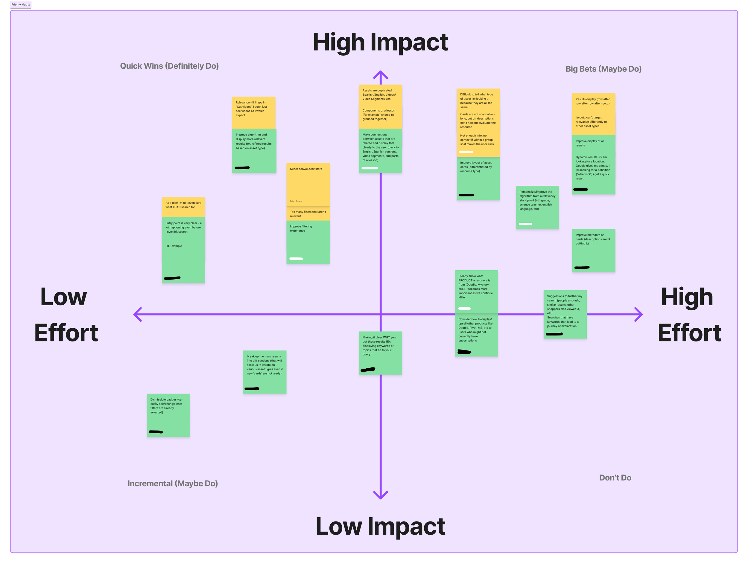
Stakeholder alignment.
To align on stakeholder perspectives around current user challenges with asset cards and search results, we shared a short set of questions to capture honest, detailed insights that would help shape the conversation.
Sample screen designs

Final Flows for Search by Standards
Browse Standards: Mobile, Tablet Portrait, Tablet Landscape, and Chromebook

Final Browse Standards